Project Reveal - RI Beach House!!!
VERY exciting news today as we finally unveil the #mrdribeachhouse. It’s the perfect summer escape so there’s no better time to let this one shine than in July! A huge thank you to Bijou Mag for sharing this project as their July feature. Very grateful to Jessica Delaney for all of her amazing photos of this house and sweat equity behind the scenes. Also thank you to Kelly Hart who helped me big time get this place styled and picture perfect.
Today I’ll start by sharing the main living spaces on the first floor - the kitchen, dining area, and living room. All three of these rooms flow into each other so you can see from one end to the other. There is a lot more to share in this awesome home and more posts will be coming soon. Let’s start with the money shot which is always the kitchen!
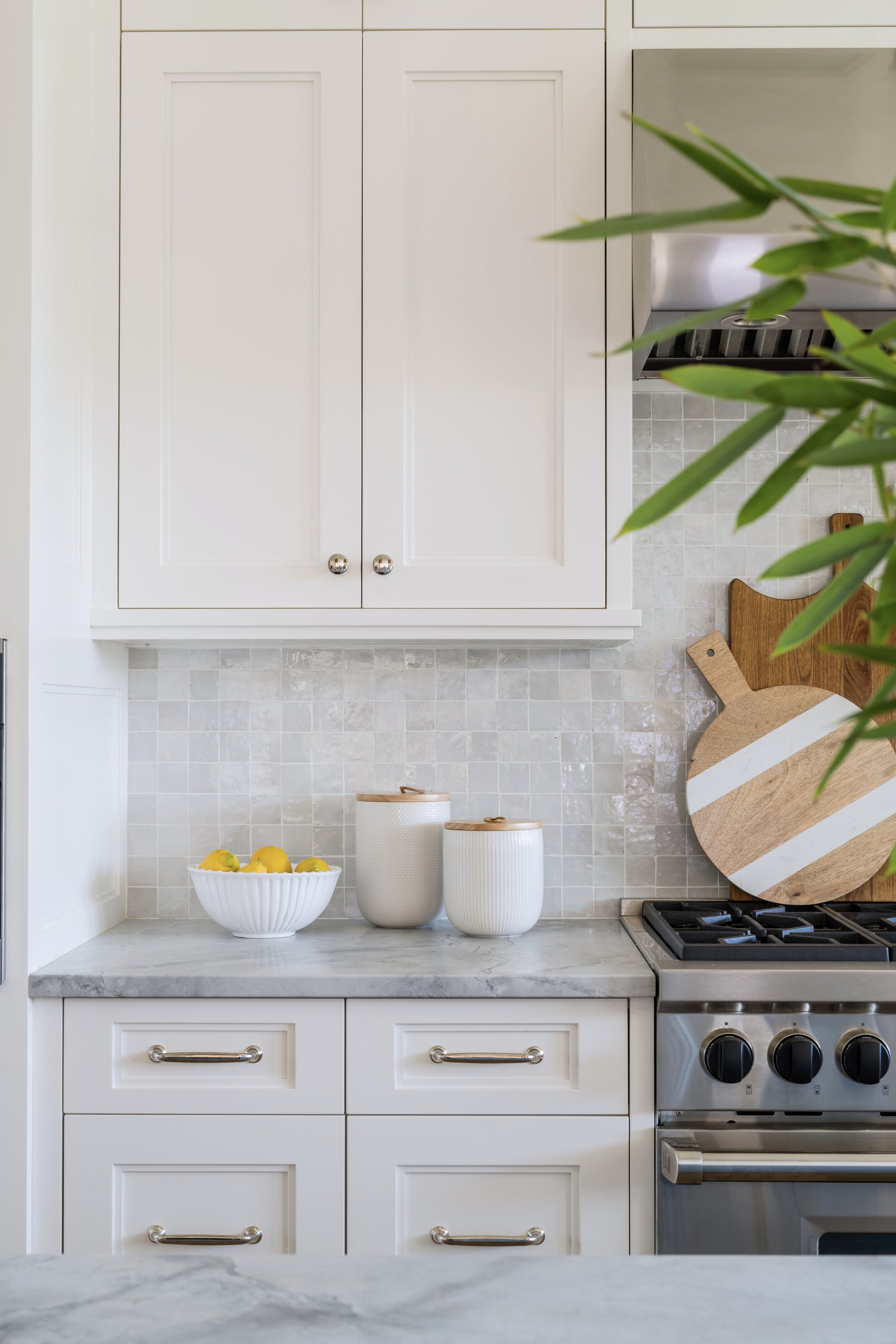
In the kitchen, my clients knew they wanted white cabinets and blue island. I chose Benjamin Moore simply white for the interior walls and millwork and carried it onto the cabinetry which created a clean look. The island was trickier! We painted many paint samples before deciding on Benjamin Moore nimbus gray as the winner. It’s a color that reads differently depending on the light (a quality I love) and also says “beach” without being overt. The next decisions were backsplash and counters. (Counter stools from Room & Board)
I chose handmade terracotta zellige tile in 2x2 squares. The tile is just plain stunning. Each piece is different since it’s all hand cut and the white color has an almost iridescent quality that catches the light so beautifully. It gave this brand new kitchen some soul and depth. The counters are super white quartzite which is a natural stone that has a very organic feel to the movement. For the range they wanted a more industrial look so we chose to also make the hood stainless.
Lighting the kitchen is always key since it’s such a focal point. The ceilings in the home are 10’ (!) so we used the height to add articulating sconces over the sink for a little sparkle. Over the island I was craving texture - my clients actually scored these basket pendants from Arhaus and they fit in perfectly. I sourced this gorgeous runner from Landry & Arcari and it tied the whole space together.
Like I mentioned, the main living spaces on the first floor all flow into each other and there was a lot of effort put into making these rooms feel connected. The architect did an amazing job of making connections and creating definition through columns and millwork.
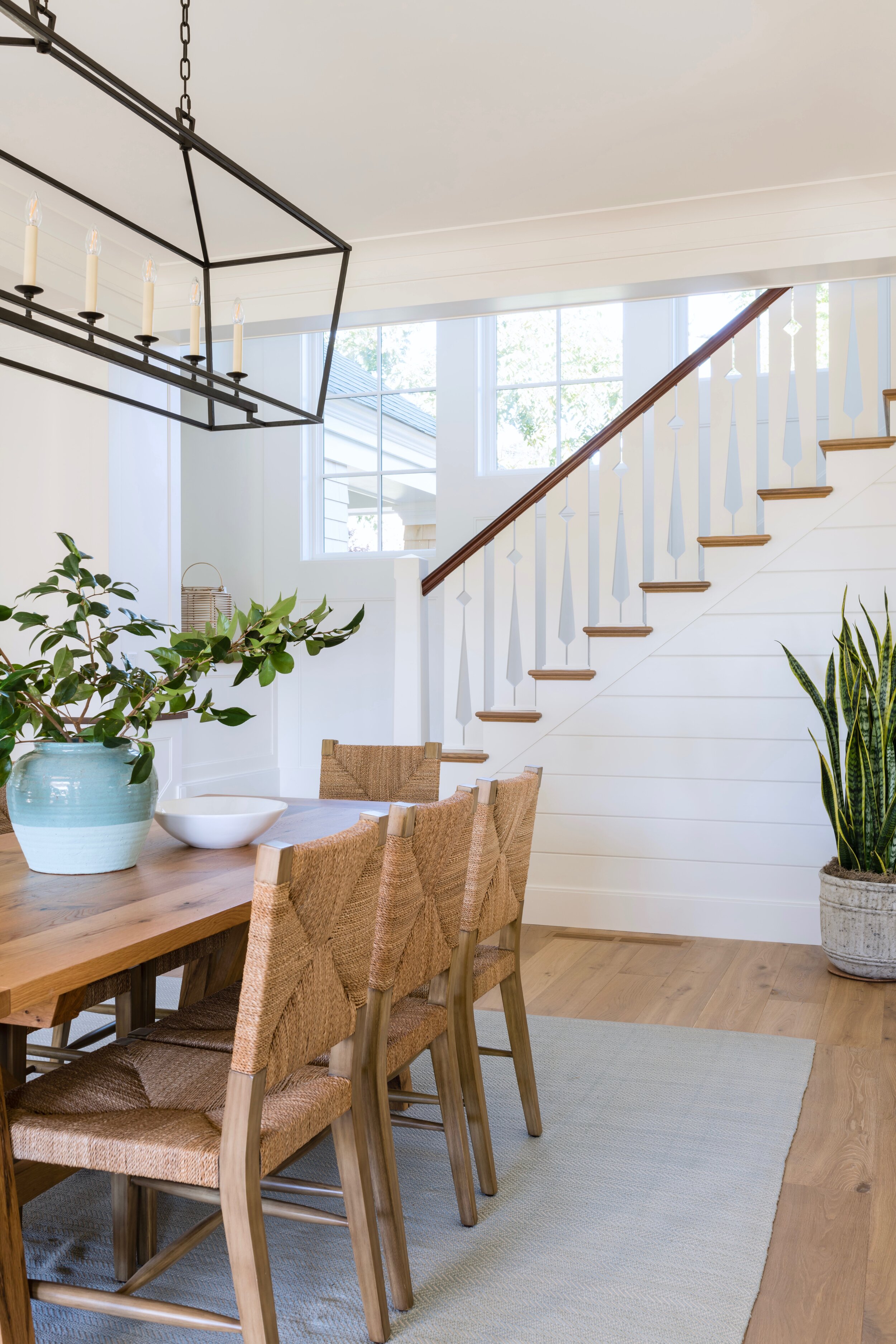
The whole idea of this home is comfort and relaxation - no stress! In the dining room I used an indoor/outdoor rug that can literally be hosed off and flipped over if needed. The table is custom in reclaimed white oak with an A frame trestle base. The woven chairs pick up on the island pendants and the big statement vase carries the blues through as well. Who wouldn’t want to throw the doors open here?
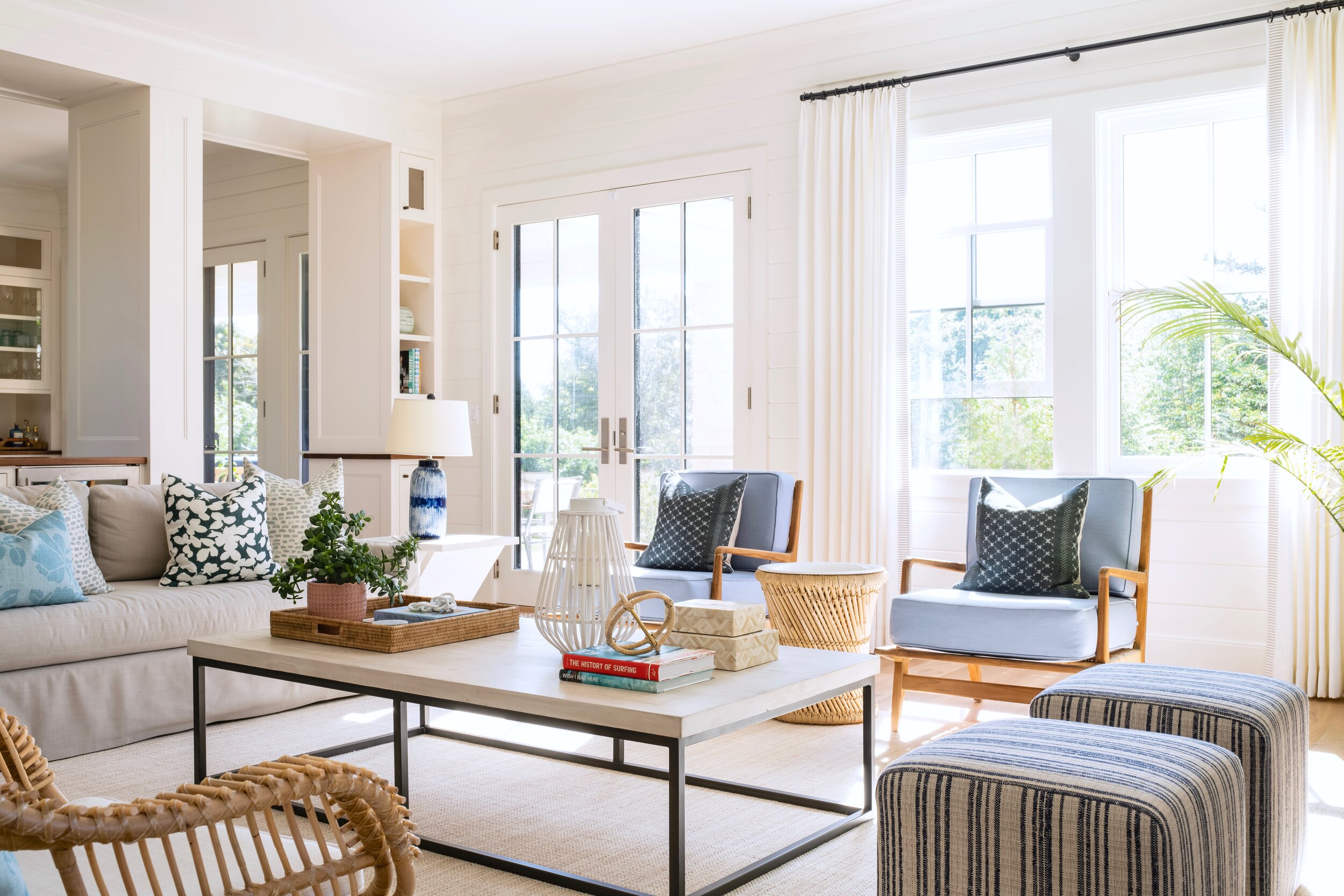
The “feet up” mentality carries through to the living room where we used family friendly fabrics that not only can take an occasional red wine spill but also stand up to the sunlight streaming in. There is enough seating for lots of guests and we added ottomans that can easily be moved around. The color palette of sandy grays and ocean blues is mixed with plenty of rattan and woven furniture.
I added tall white drapery with a striped trim to dress the windows but still keep them casual. They are light and airy and soften the shiplap. We designed the fireplace with a soapstone surround and herringbone bricks lining the interior. The artwork throughout the home was chosen by my clients.
That’s a wrap on these spaces but I’ll be sharing a lot more this week! The biggest thank you of all goes to my amazing clients who trusted me on this journey and put the vision of their dream home largely in my hands. It was an honor and I am genuinely thrilled knowing they love every inch. The best example of why I do what I do!
Sources:
Interior Design: Meredith Rodday Design
Architect: Paul Weber Architecture
Builder: Old Port Homes
Photography: Jessica Delaney Photography
Cabinetry: Downeast Woodworks


