#CountryChic Family Room and Breakfast Room
I'm super excited this week to share the continuation of the #countrychic project! you've seen the dining room and living room previously and today I'm sharing the family room and breakfast room. later this week will be the mudroom and office! i've been working with these clients for just over three years and we have just about completed the first floor. so without further delay, let's take a look at the BEFORE!
before of the family room:
and now for the AFTER! photos by Jessica Delaney Photography 💙 we didn't photograph the fireplace side of the room in the "after" but we moved the tv from the easel stand in the corner and mounted it over the fireplace. this allowed every seat to have a view of the television.
the existing family room was chock full of beige and gray and had zero personality. the goal was to make a comfortable but elegant space where this family of four could curl up and hang out together. we didn't keep much but the two things we we did keep were the drapery and the coffee table - the rest went down to the basement or was donated.
the first thing I did was to slather some benjamin moore simply white on the walls to freshen it up. it also helped the existing drapery (which we had hemmed) stand out. before the walls were almost the same color as the drapes. the furniture layout allowed for the piano to relocate from the living room to the family room.
moving the piano created an opportunity for a little moment so we added art and a beautiful picture light above which was actually pretty hard to wire for (thank goodness for really good electricians!) but so worth it in the end!
the room has a bump out that creates a natural spot for storage and we contemplated built ins but in the end we opted for a custom painted cabinet with grasscloth doors.
this was the last area to come together - the sconces were a no brainer but the art was more difficult to find. the key was to find something that tied the room together and this piece picks up on the plum tones in the rest of room. unfortunately it came with a so-so frame so we had it re-framed in a simple gray float frame that doesn't distract from the art.
the family room is open to the kitchen and breakfast room (i'd say nook but it's bigger than that!). it was important to carry that same comfortably elegant feel into this space.
here's the BEFORE!
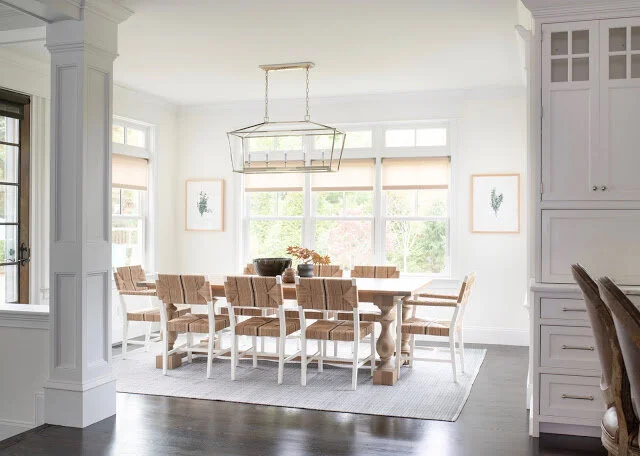
it was fine but again, just kind of lacking personality. plus there was too much wood - table, chairs, and the light fixture is too much of the same. here is the AFTER!
it took me months to convince my client to replace the existing wood chandelier which, to be fair, was a fairly recent purchase. the room needed a tiny bit of bling just like an outfit needs jewelry! together with more simply white paint, new chairs, an indoor/outdoor rug (that fit the space better), and simple artwork the room came alive.
a big thanks to my clients who have trusted my vision for multiple years now to help them take their home from ok to awesome! i'll be back later this week with the office and mudroom!
selected sources:
sofas - lee industries | family room rug - landry & arcari | coffee table - restoration hardware
dining table - restoration hardware


