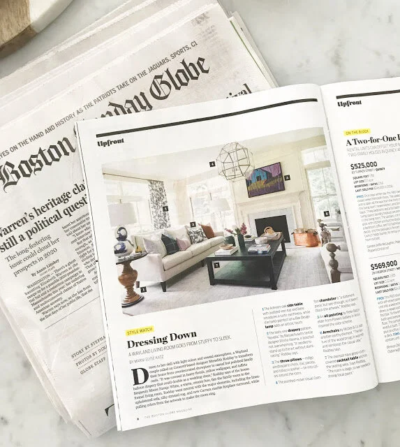
Client Project: Plain Road Living Room
you may have seen if you follow me on instagram that I WAS IN THE BOSTON GLOBE YESTERDAY!!! here's the link to the online version: http://www.bostonglobe.com/magazine/2018/01/19/wayland-living-room-goes-from-fussy-fabulous/eGPFIAeliVD9rOZoixVptM/story.html
if you can remember back to october of last year when i posted the reveal of this house, there was one room that i had to leave out. it was this one! i knew it had been accepted to the globe so i had to hold onto the images until it was released. they require fresh, new content that no one has seen. so fast forward to yesterday when it made its debut and now i can share away!
first though, you need to see the befores! in the article i mentioned that the drapes were basically wedding dresses hanging from rods. you can see why below!
those drapes! i mean you can't even see the window on the right. and what is this bizarre furniture placement??!!
and AFTER!! *all photography by jessica delaney* please do not use without asking first!
the first thing we did was to completely empty the room (with the exception of the baby grand piano that the previous owners left) and strip the yellow textured wallpaper. we then painted the walls the same color as the trim in the rest of the house - navajo white. we also got cracking on the fireplace surrounds and switched this one to cararra marble as we did for the dining room and entry fireplaces.
these clients are art lovers and they selected all of the art in their home themselves with dimension guidance from me. when they brought home that gorgeous peter batchelder, that's when the palette for the room really started taking shape. we had already chosen a neutral sand-colored sofa and the white wood frame chairs. those would work with anything and they also let the art be the star of the show which was important. i pulled the purple from the painting and used it in pillows and since my client loves blue (no wonder we get along so well!), i sprinkled various tones of navy throughout the rest of the room.
i knew i wanted to use a large coffee table to anchor the space on the fireplace so we ended up choosing a custom made 40x60" table that's wrapped in navy blue grasscloth. it's a stunner and added some much-needed texture. styling a table that large was a beast! but groupings of items helped it make sense. and i made sure to use purple flowers in the vase!
another area of focus was the lighting - there was none before! i mean there are pot lights in the ceiling but no ceiling fixture. i am in love of the lantern that we chose - it's the perfect piece of jewelry for the space. and since it's glass, it doesn't block the art. i've used that floor lamp before and will use it again. it's the perfect shape and a total crowd pleaser. i also chose to mix metals with the lighting and while that might seem like a risk, i think it helped make the space more interesting.
the last two pieces to fall into place were the rug and the drapery fabric. we needed a pattern that was strong enough for the art in the room (there are two additional pieces) but that didn't overpower. i am so happy with the final choice. i also chose to add drapery back only on the large window in the front. the casing on the side windows touch the fireplace which caused the previous drapery to either cover the windows or be awkwardly bent around the mantle. no thanks. we let the light come in and made the largest window sing.
the husband is an avid cyclist so they commissioned a piece by heather blanton to hang on this wall. i think it's so cool and really tied in perfectly. to the right of the chair in this view is where the piano sits. we didn't end up taking photos of it because that angle didn't tell the story of the room. above the piano though is a very bold, large, almost lacquered, striped piece of art. since it makes such a statement in the room, i chose to keep the rug very neutral. it's a stried medium gray that is very easy on the eyes.
if the piano weren't a factor, we might have added some additional seating since the room is so large. in the end i'm thrilled with how the space turned out. it's a comfortable spot to entertain (and yes, we treated all of that light colored furniture!) that i think feels warm and inviting. thank you to everyone you left such nice messages the last few days. and a big thank you to jess delaney and marni katz for the globe feature. my first time being published feels incredible!


