Client Project: Plain Road
hello!! if i could do cartwheels or backflips, i'd be doing them right now. i've dreamed of writing this post for so long and now the time is here! i am so excited to share my #plainrdproject with you all. i started working with this client about a year ago and in this first phase we covered the dining room, entry, living room and powder room. the home was built in 1997 but decorated like it was 1987 and was covered in bad florals, hunter green, and crazy drapery. so we set to work on bringing these spaces into modern day. let's start with the dining room!
BEFORE. the drapery literally could be used for a wedding dress. the heaviest taffeta on giant honking wood rods.
it was a sad state of affairs.
AFTER.
photo by jessica delaney photography
the dining room doesn't get a ton of natural light because there is a porch overhang outside of all of these windows. i wanted to really lighten it up so we stripped that dark green wallpaper and added new grasscloth in a light sand color. it made a huge difference. i also changed out the marble in the fireplace (three of them actually!) to a classic carrara. it was ugly green marble before. my clients didn't want a super fancy/formal dining room and these pendants help set that tone. i replaced that insane drapery with simple white linen trimmed in a a pretty blue and tan tape.
photo by jessica delaney photography
my clients have a large extended family so we had a massive 13' table custom made to accommodate 14 people and used one of my favorite rugs to ground the room. the husband requested one thing and that was leather chairs so we kept him happy and they help keep the vibe more casual.
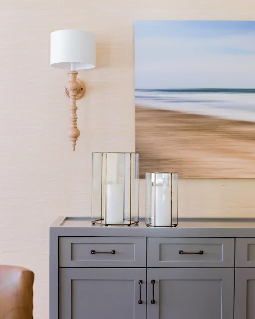
all of the art in the home was chosen by my clients - they have specific taste and wanted some special pieces that they chose together at galleries. my job was to tie to together with each space. this photo is by doug hockman. i also had this console custom made as we weren't finding exactly the right thing for this spot. i paired it with some of my favorite sconces by dunes and duchess that are even prettier in person.
photo by jessica delaney photography
now on to the entry!
BEFORE. green, green, and more green.
AFTER. buh bye green!
photo by jessica delaney photography
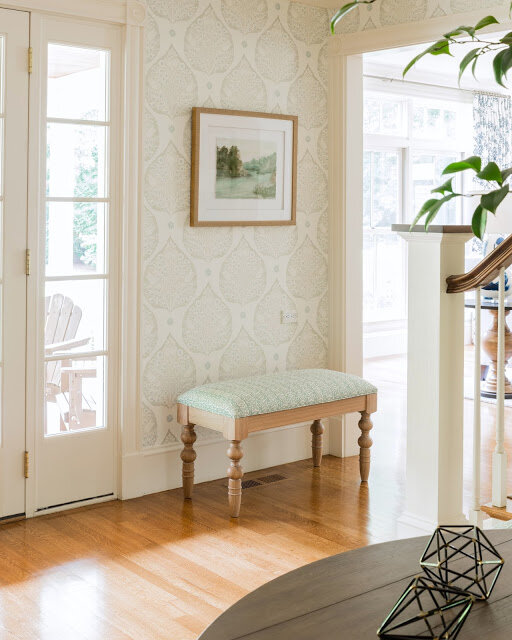
the most exciting part was clearly removing that wallpaper and adding this custom-colored beauty by galbraith & paul. i'm so glad my clients decided to go for it with this pattern - it completely makes the space. before there wasn't a chandelier or any light in this pretty two story entry so we fixed that by installing this gorgeous crystal one. it add just a bit of sparkle in this otherwise mostly neutral space. i always like to add a touch of drama and a crystal chandelier fits that bill!
again the artwork in the entry was chosen by my clients - and i loved it! - so i had these custom benches made and covered them with a pretty galbraith & paul fabric to pull out the tones in the artwork as well as a bit of blue in the wallpaper.
photo by jessica delaney photography
the powder room is up next and also a little pass-through hallway just outside of the powder room which was a little bonus spot to clean up and make pretty!
BEFORE. can we say poop brown? like wallpaper, counter, and although you can't see it here, the ceiling was painted, yes, brown. 😳
AFTER. like a breath of fresh air right?!
photo by jessica delaney photography
the wallpaper, sink console, mirror, and sconces all just make for a light and bright space in a room that doesn't have a window. the crystal stem detail on the sconces is such a great detail. it really is all in the details!
a little accessories switch up between shots :) but isn't this counter, backsplash and washstand just so pretty? we were very limited in terms of depth of the counter because the size of the door that swings into this room. there was no room for a regular faucet so we opted for a wall mount which worked out really well.
photo by jessica delaney photography
and what's reflecting in the mirror is this little nook outside the powder room. the artwork here is by elizabeth becker. the texture on this lamp is so gorgeous and i love pairing it with this simple gray vase that i found at homegoods!
photo by jessica delaney photography
last but not least, the living room! except i can't show it to you...yet!! it's super exciting and hopefully come november i'll be able to explain more. i might just be leaving the best for last!
a huge thank you to my amazing clients who really were so wonderful to work with. it makes such a difference! also a special thanks to jess from jessica delaney photography. she not only worked her magic behind the lens but pushed me and helped me to set up these shots as perfectly as possible.


